- Feb 4
- 1 min read
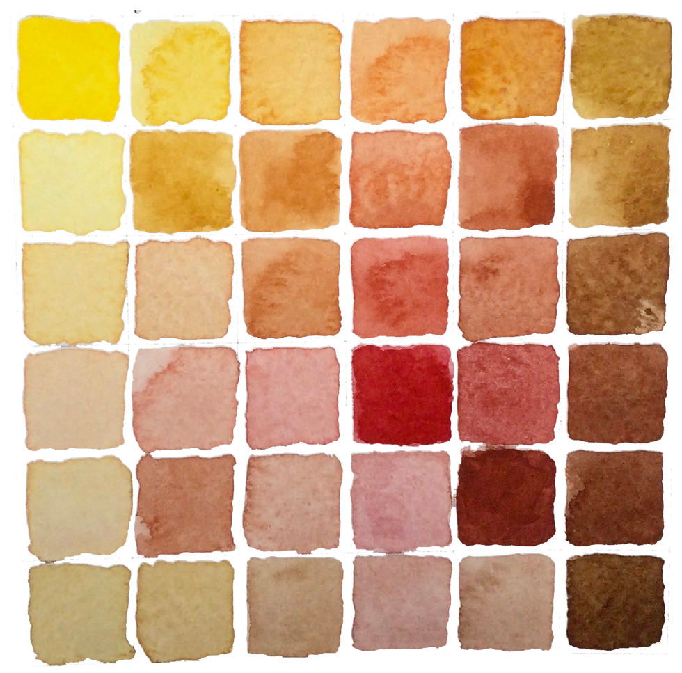
Autumn Colour palette

Ferrous & Bone's Warm Autumn colour palette has been created from our hand-made watercolours to help you celebrate the season.
Here’s the inspiration behind the colours
Before winter pares everything back, autumn gives us one last glorious show of glowing golds, earthy reds, and warm, grounding browns. That’s exactly what inspired the Warm Autumn Collection, a warm palette of colours that capture the richness of the season.
Each colour brings its own personality to the set, from the cheerful spark of Hansa Brilliant Yellow to the deep, velvety tones of Burnt Umber. Together, they bring the crunch of leaves, the glow of candlelight, and the drama of long autumn evenings straight onto your paper.
Let us introduce the players:

Hansa Brilliant Yellow
The cheerful spark of the palette, a warm, bright yellow that lifts everything it touches and adds a gorgeous richness in mixes.

Italian Gold Ochre
Soft and glowing, this earthy yellow is like autumn sunshine caught on paper.

Orange Iron Oxide
Grounded and bold, this earthy orange steps in as a deeper, richer cousin to Burnt Sienna.

Scarlet Deep
Passionate and confident, these strong scarlet tones blend beautifully and bring real vibrancy to the page.

Red Iron Oxide
Earthy and dramatic, this rich red-brown adds contrast and depth, anchoring the brighter shades.

Burnt Umber
The wise elder of the palette, with a huge tonal range that shifts from rich, velvety darks to pale sandy highlights.
And together they create quite a show as seen here on our Warm Autumn colour mixing chart


Comments