- May 5
- 4 min read
How Pigment Choice Shapes Watercolour Painting

Understanding how pigments shape watercolour painting is about predicting how the colours will perform on the paper.
That understanding allows the artist to work more intentionally: in washes, in layering, in mixing, and ultimately in the longevity of the work.
Watercolour, in its essence, is a stripped-back medium: pigment dispersed in a solution of gum arabic. There is no opacity to obscure behaviour, no impasto to mask indecision. The white of the paper is not just a surface but an active participant. Because of this, pigment characteristics are not incidental, they are the language of the medium itself.
Every pigment carries a set of inherent behaviours. These are not marketing distinctions, but physical realities rooted in particle size, structure, and chemistry. Among the most consequential are granulation, transparency, staining, lightfastness and the pigment’s identity as defined by its Colour Index.
Here we will look at these five behaviours and how the watercolour painter can work with them.
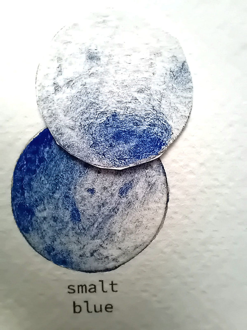
Granulation
Granulation in watercolour painting is not an effect applied by the painter, it is a consequence of particle physics.
Pigments with larger, heavier particles will settle into the micro-topography of the paper, separating from the wash and gathering in its valleys. The result is a textured, often unpredictable surface that can introduce atmosphere, depth and visual complexity without additional intervention.
Ultramarine Blue, Smalt and Cobalt Turquoise are archetypal examples of granulation. These pigments are assertive in their separation and movement. Ochres and Malachite offer a more restrained granulation, while Cadmium pigments, for instance, remain resolutely smooth, producing even, flat washes regardless of handling.

For the painter who selects a granulating pigment they are considering not just the colour itself, but also the structural work it will do for them on the paper.
Transparency and Opacity
All watercolour operates on transparency, but not all pigments transmit light equally.
In dilute washes, this distinction is subtle. In mass tone, it becomes decisive.
Highly transparent pigments such as Quinacridones and phthalos, allow light to penetrate, reflect off the paper and return through the paint layer. This is what enables clean glazing: layering a colour over the top of another thus creating a third colour or tone as it shines through the transparent wash.

More opaque pigments such as Cadmiums and iron oxides scatter light differently. In heavier applications, they assert themselves, softening or even obscuring what lies beneath. Their presence can anchor a composition, but they resist the luminous layering that defines classic watercolour handling.
Understanding where a pigment sits on this spectrum informs not just how it’s used, but whether it should be layered at all.
Lifting and Staining
The interaction between pigment and paper fibres defines whether a colour can be moved once it has settled.
Non-staining pigments tend to sit closer to the surface. They can be reactivated, lifted with a damp brush or cloth. or The removal of the colour can be used to recover light or adjust form. This lends flexibility particularly in subtractive approaches.
Staining pigments behave differently. Prussian Blue is a familiar example: it penetrates the fibres, binding itself beyond easy retrieval. Attempts to lift will often leave a residual ghost of the initial mark.

Neither is inherently preferable. Staining pigments offer decisiveness and clarity in layered work; lifting colours offer adaptability. The key is knowing which behaviour you’re committing to at the point of application.
Lightfastness
For work intended to endure, lightfastness is non-negotiable.
A pigment’s resistance to UV-induced change determines whether a colour will remain stable or shift over time. Most contemporary pigments are engineered for high lightfastness and reputable manufacturers will indicate this clearly.
However, not all pigments are equal. Traditional lake pigments, for example, are often fugitive, meaning they are prone to fading or alteration. Their use requires intent and acceptance of impermanence.
Even with stable pigments, context matters. Display conditions, particularly exposure to direct sunlight, will influence longevity. Lightfastness ratings are not absolutes as they are thresholds observed under controlled conditions.
Colour Index: The Pigment’s Identity
Beneath every paint name is a more precise truth: the Colour Index.
A designation such as PY74 (Pigment Yellow 74) tells you exactly what you’re working with, regardless of branding. It’s the most reliable way to understand a pigment’s composition, predict its behaviour and compare it across ranges.
For mixing, this matters.
Single-pigment paints offer clarity and repeatability. Their interactions are more predictable, their mixtures cleaner. Multi-pigment formulations, such as many versions of Payne’s Grey, introduce complexity. They can be useful and can be referred to as ‘convenient colours’ as it means the colour produced is reliably consistent. However, each manufacturer will have their own formula for a Payne’s Grey and so the colour and nature will vary significantly.

Reading the Colour Index allows you to make informed decisions: about temperature bias, granulation and about whether a colour is a genuine pigment or a constructed hue.
Conclusion:
Working With, Not Against, the Material
At an advanced level, watercolour becomes less about controlling outcomes and more about selecting the right behaviours from the outset.
Pigment choice determines how a wash settles, how a glaze reads, how a mix resolves and how the work will age. It’s not a secondary consideration, it’s foundational.
To understand pigment is to understand what the paint is capable of before it touches the paper. And from that point, every decision becomes more deliberate.


Comments